Revi Brew
Elevating the kombucha experience.
Revi Brew, derived from the word 'revive', came from the belief that kombucha should be as good as the ingredients behind it. The brand reimagines the everyday fermented drink as something that can restore and revive the body with every sip.
Redefining the conventional portrayal of kombucha, the brand was built around organic ingredients, quality tea, and careful fermentation control. With microbial harmony, natural flavour development, and less sugar at its core, Revi Brew is a cleaner, more elevated take on an ancient craft.
Scope

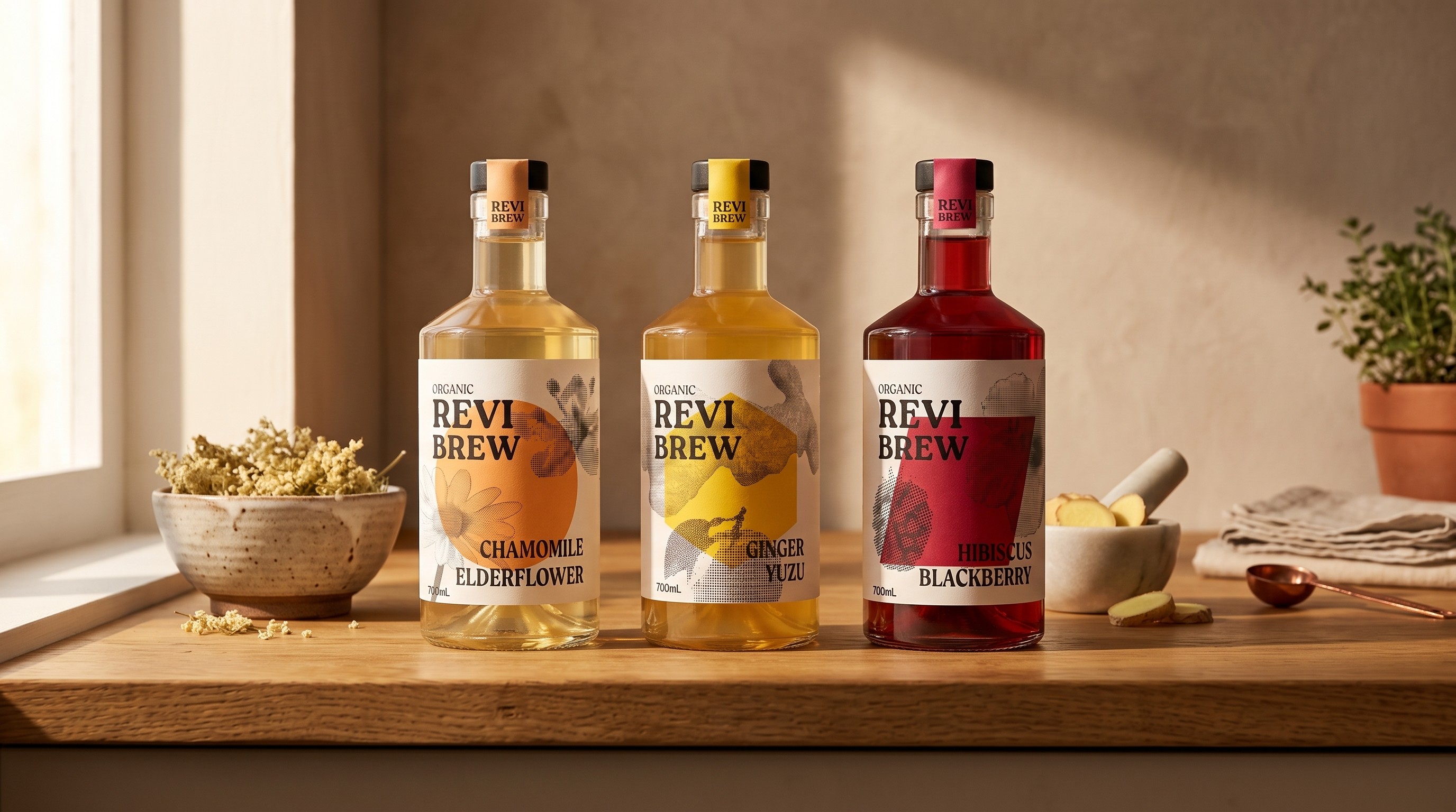
The logotype is a balance between strength and softness, a bold typeface rooted in confidence but softened by clean, smooth edges that reflect the organic and wholesome nature of the brew. The contrast between the heavy brand name and the lighter flavour descriptor below gives the mark a structured, deliberate feel that reflects the brand's commitment to quality.

Drawing inspiration from the raw qualities of each ingredient, every colour and form across the Revi Brew range is shaped by the purpose of the flavour it represents.
The Ginger Yuzu variant adopts a warm golden yellow reflecting its spicy citrus character, while the hexagon form evokes strength, nodding to the immunity-boosting and health-strengthening qualities of the blend.
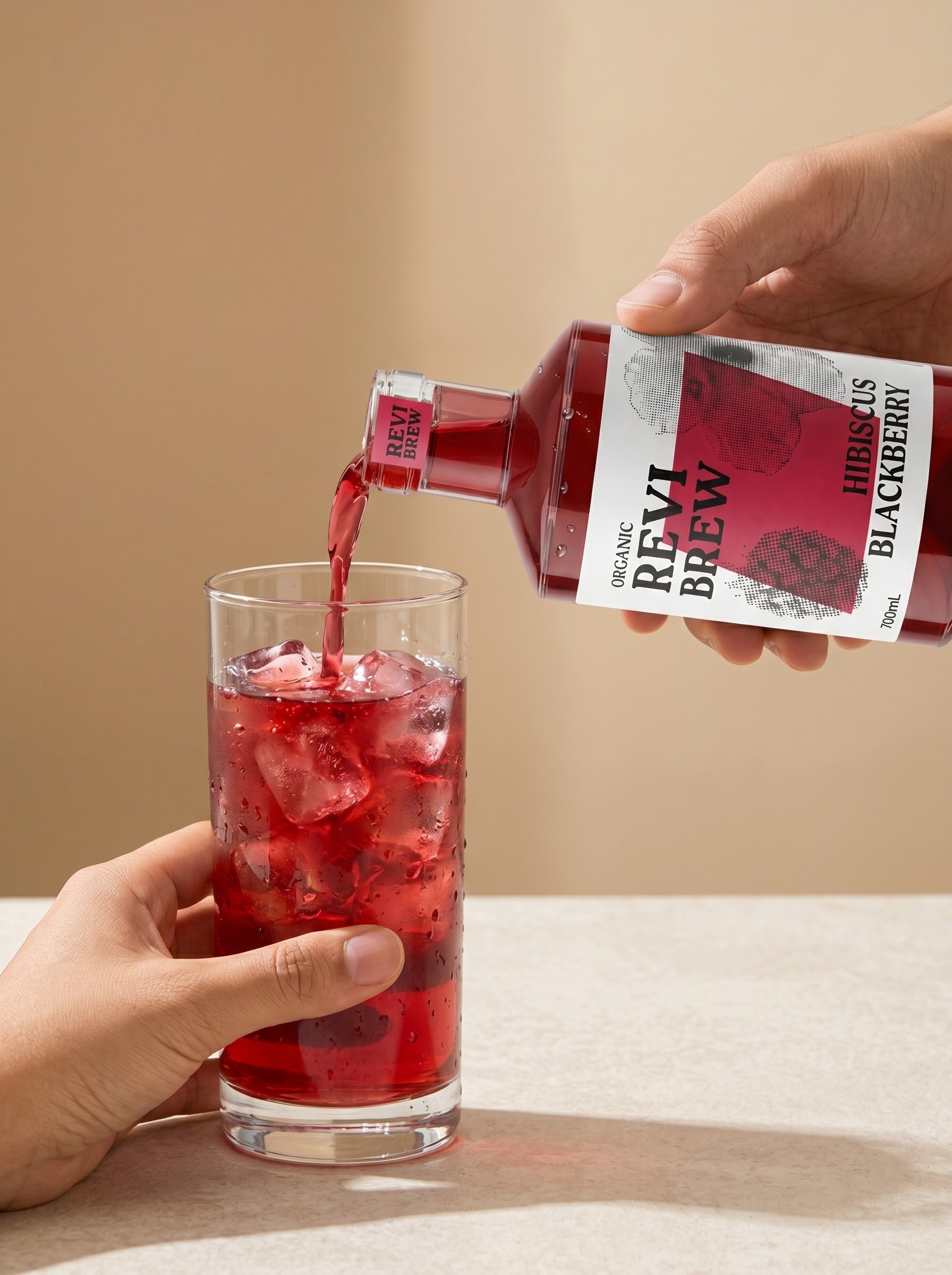
Hibiscus and Blackberry draws from a deep pink-red palette, capturing its floral, fruity notes, with a rhombus shape that suggests movement and revitalisation.
Chamomile and Elderflower is expressed through a soft peach-orange, echoing its gentle floral nature, anchored by a circle that speaks to balance, calm, and everyday wellness.



Ready to bring your ideas to life? Share your vision with us or just drop a hello — we’re excited to collaborate with you!

© 2026 Studio Formlus. All rights reserved